Self-expression is the name of the game when it comes to the top colors for decorating your home in 2023.
In what Veranda magazine describes as a new “era of vibrancy,” designers are seeing the crisp, cool tones of the past decade give way to an exciting mix of bolder, playful shades. The somber events of recent years have homeowners craving more adventurous color combinations and interiors that evoke a sense of joy and wellness.
There are many factors to consider when choosing colors for your walls, upholstery and other items. Besides aesthetic preferences, you’ll want to think about lighting conditions and how various shades complement one another. Above all, your goal is to mix the right blend of colors and patterns to create a personal space that’s uniquely yours.
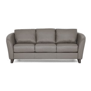
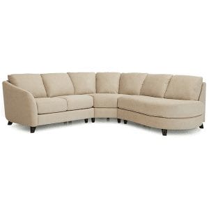
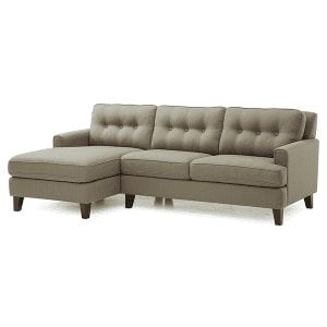
Lifestyles Furniture offers a wide array of quality home furnishings with customizable options that let you choose the perfect colors for your decor. Let’s take a closer look at this year’s favorite colors to get you started.
Go Bold
Perhaps nothing captures the spirit of 2023 better than Pantone’s Color of the Year, Viva Magenta. Inspired by the vibrant natural cochineal dye found in Latin America, this exuberant color evokes a welcoming and energetic sense of optimism, strength and courage that is inclusive of all. It is a confident, saturated color that pairs well with soft beige, green or blue. It’s also great for livening up lighter earth tones.
Another great choice for adding a charismatic charm to your space is Raspberry Blush by Benjamin Moore. Described as “coral tinged with pink,” this bright and cheery red-orange energizes any room and looks fabulous on walls or trim. Pair with soft whites or beige for maximum impact.
If you’re looking for a more cozy and introspective vibe, Terra Rosa by Dunn-Edwards offers a deep rosy pink with a hint of terra cotta. It’s a refreshing alternative to brown or burgundy and reflects the “beauty in everyday small pleasures.” This versatile warm color works well as either a grounding neutral or delicate accent.
Other popular warm tones include soft yellows and rust shades. You can also create an eye-catching contrast by pairing saturated colors like bright magenta with soft blush tones.
Think Green
From nature-inspired midtones to yellow-tinged citrusy colors, you’ll find a wide array of greens to complement almost any decor, from the playful to the sophisticated.
For a serene, casual mood with just a hint of understated luxury, go for a dark shade like Spanish Moss by Krylon. This enchanting, subdued green hue evokes the soothing feel of a rich, dense forest. Pair it with gold or copper tones for a calming, comforting elegance.
If a cooler blue-green is more your style, Vining Ivy by Glidden is a versatile choice that looks fabulous in traditional and contemporary spaces. It creates a tranquil mood and complements a variety of stone accents as well as a range of wood finishes.
Sing the (Happy) Blues
Give your space a refreshing, outdoorsy feel with a soft, airy blue that evokes a clear sky on a sunny day. Good examples include Palladian Blue or Mt. Ranier Gray by Benjamin Moore. These shades look fabulous in a living room or an enclosed porch.
Other popular blues include a deep blue-gray for adding interest and depth, or a bright, saturated ultramarine for creating a luscious, coastal vibe.
Cozy Up to Warm Neutrals
Designers are noticing a shift from the crisp neutrals of recent years in favor of warmer shades that create an atmosphere of comfort and stability. Mid-tone browns in particular give almost any room a soothing, organic feel.
Inspired by “new traditions and the warmest welcome home,” Aged Barrell by Minwax is a deep brown stain punctuated by rich, neutral undertones. It highlights the unique grooves and imperfections of wood surfaces to bring out a distinct sense of character. Pair it with a range of appealing colors from bright greens and oranges to soft pinks or blues. Other popular dark neutrals include black, deep chocolates and dark violets such as plum.
For a lighter neutral with graceful, pink undertones, Redend Point by Sherwin-Williams softens up the look of any room. This subtle blend of blush and beige looks wonderful when paired with textiles or wood accents. It also provides an appealing base that complements terra cotta or clay colors.
Another wonderful color upgrade is to switch to a softer, creamier white such as Blank Canvas by Behr. This calming shade promotes creativity and concentration, which makes it a perfect choice for home offices and study areas. It looks great with other neutrals, earth tones and pastels, or you could pair it with black for a more dramatic ambience.
When it comes to choosing new colors for your home decor, 2023 offers a wide range of exciting possibilities. Lifestyles Furniture makes it easy to find the perfect home furnishings to update almost any room in the house. We also let you customize your furniture with upholstery fabrics available in a wide variety of colors, patterns, textures and price points.
Contact us online or come by today to find the perfect furnishings to fit your personal style!